
January 28, 2021
Logstail Platform new features!
 Introduction
New year, new platform!! We’ve just released our new version of Logstail! We are proud because all the hard work has just paid off! New User Interface with improved functionality, Machine Learning, Reporting, Email Alerting, Extended team collaboration, and of course Security are only some of the new features of our platform. Let’s dive deeper and explore them!
New User Interface

Logstail now offers a completely new user interface with added functionalities. First of all, we have redesigned the front end from scratch! Our fresh UI incorporates a handful of features to help you and your team for even more effective log management. The response now is snappier, the graphical user interface is modern and you get all the information you need at a glance of an eye! In other words, you get an enhanced User Experience when interacting with the platform.
Also, you can track the data usage (monthly and daily) of Logstail very easily in a comprehensive dashboard immediately when you log in to the platform!
In general, when you log in to the platform, you are presented with a general Overview, namely your Current plan status, and a button to change it if you wish. Also, you can copy your stack’s token if you want to use it in another tab.
Finally, and to save your time from searching, we added the most popular helpful links like inviting users to join your stack, change your plan, add shippers and finally contacting our support team! Realistically, it can’t be easier than that!
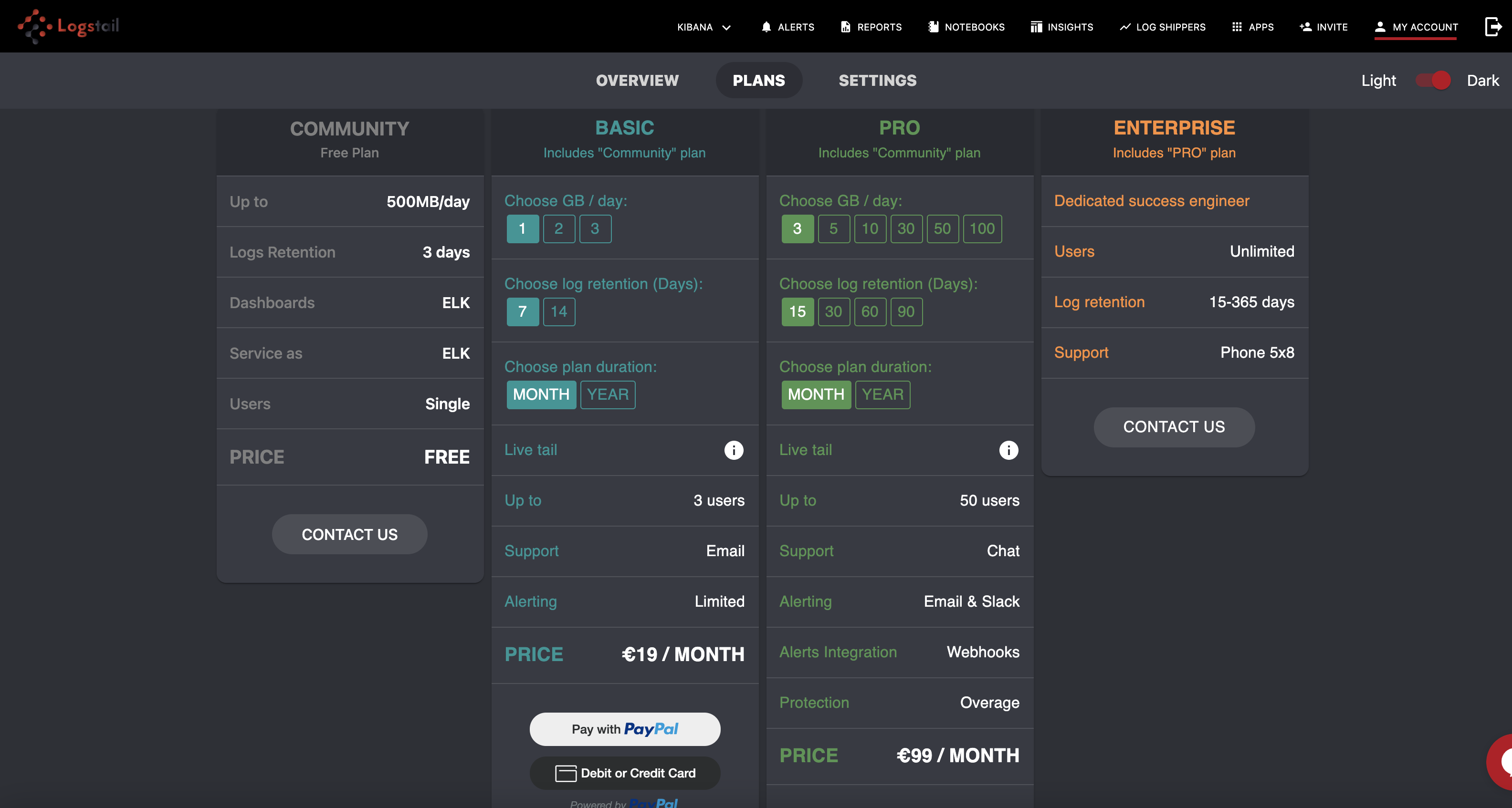
Plans:
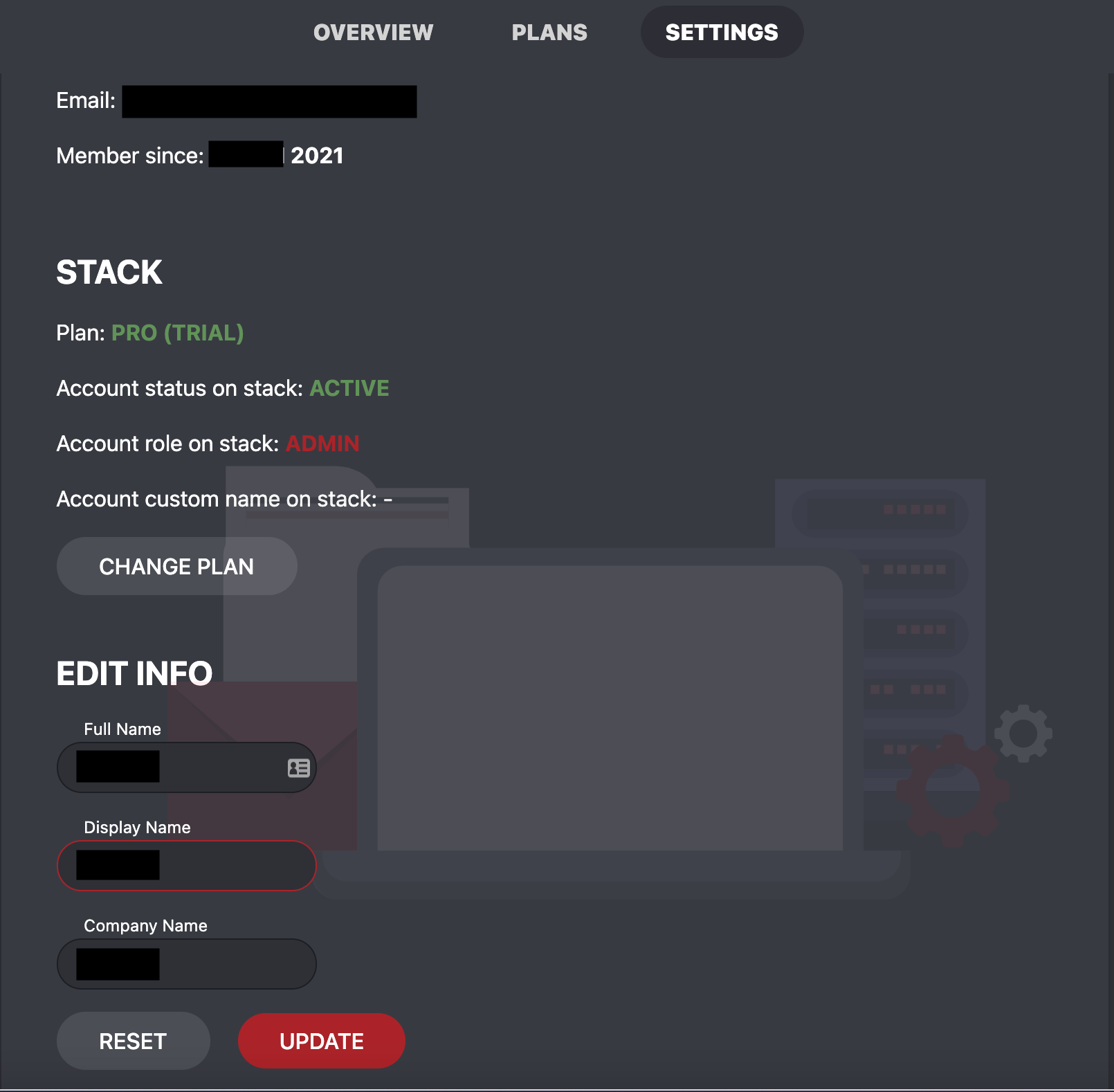
Settings:
What is the value of the new Insights feature for you?

Machine learning is something that every organization needs nowadays. The vast amount of data produced and the need for automation are making the employment of Machine Learning techniques a necessity. We now offer Anomaly Detection (!!) through the Insights tab to provide granular insights from high-volume log streams by identifying and isolating anomalies from IP addresses or hostnames. You can save time and resources by identifying the problem in less time and mitigating it before it gets a real issue for your infrastructure.
In detail, Anomaly Detection enables the use of Machine Learning algorithms to automatically detect anomalies in the log files you send to our platform. If you combine this functionality with our Alerting feature, then you can monitor your data in real-time and also get alert notifications!
But what is an anomaly? The answer is that anomaly is any unusual change in what is considered normal behavior. For example, anomalies in timestamp related data can lead to proactive actions before an issue becomes a real problem for your company. Take, for example the use case when your IT administrator observes an anomaly in a disk usage metric which may be a sign of a near-future system failure.
The solution we gave before the implementation of the new platform was by creating visualizations and dashboards and defining specific thresholds and finally setting alerts based on these thresholds. The problem with this approach is the fact that it is not adaptive to changes that occur from the always-changing environment or from time-based changes. In other words, we need a “clever” approach to effectively be alerted!
Today, we can offer our customers something completely new! The Insights feature has the ability to detect anomalies in the Elasticsearch data in near real-time using an advanced algorithm (Random Cut Forest – RCF). This algorithm has the ability to model a sketch of the incoming data and compute the appropriate parameters (anomaly grade and confidence score value) for the incoming data, based on a scheduled job running under a job-scheduler. In the next step, these values are used to differentiate the normal from the non-normal behavior.
Reporting
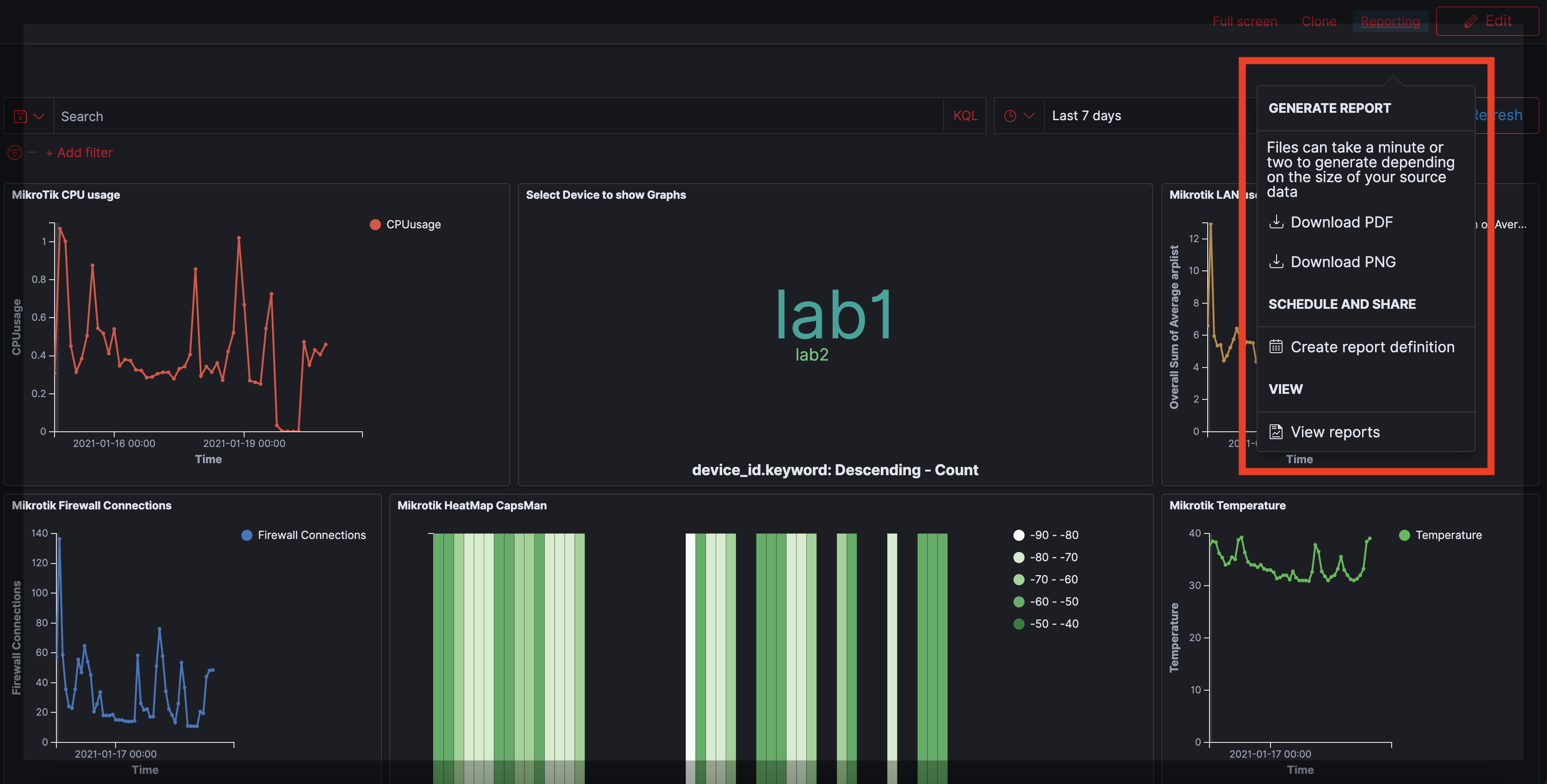
Reporting is an essential element of any professional monitoring tool. We significantly enhanced our reporting feature and now we can offer new choices like the ability to create PNG, PDF, and CSV reports.
Create reports from Discovery, Visualize, or Dashboard
From now on, you can quickly generate a report from the current view you are! The process is very easy.
- From the top bar, choose Reporting.
- For dashboards or visualizations, Download PDF or Download PNG. From the Discover page, choose Download CSV. Your report may take some time to be generated, and when the report is ready to download, you will get a notification.

Create reports using a definition
You can also create a schedule-based report, by choosing Create report definition. This option will pre-fill many of the fields for you based on the visualization, dashboard, or data you were viewing. The steps are the following:
- From the left navigation panel, choose Reporting.
- Choose Create.
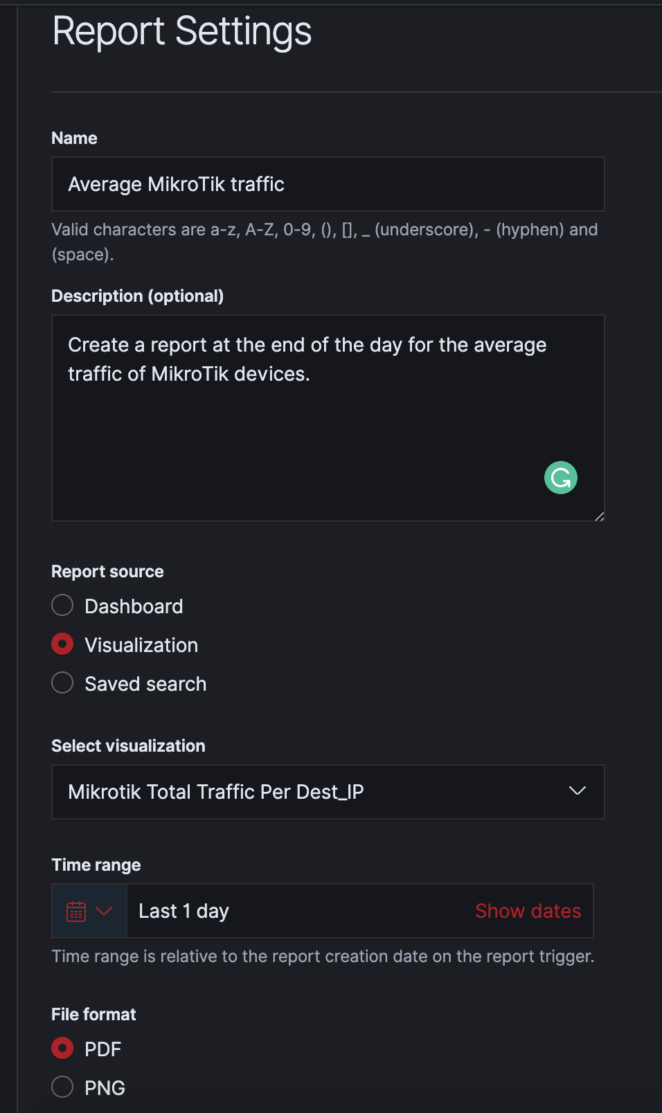
- Under Report Settings, enter a name and optional description for your report.
- Choose the Report Source (i.e. the page from which the report is generated). You can generate reports from the Dashboard, Visualize, or Discover pages.
- Choose your dashboard, visualization, or saved search. Then choose a time range for the report.
- Choose an appropriate file format for the report.
- (Optional) Add a header or footer for the report. Headers and footers are only available for dashboard or visualization reports.
- Under Report trigger, choose either On-demand or Schedule. For scheduled reports, choose either Recurring or Cron based. You can receive reports daily or at some other time interval. Cron expressions give you even more flexibility. See Cron expression reference for more information.
- Finally, choose Create.
Kibana Gantt Charts
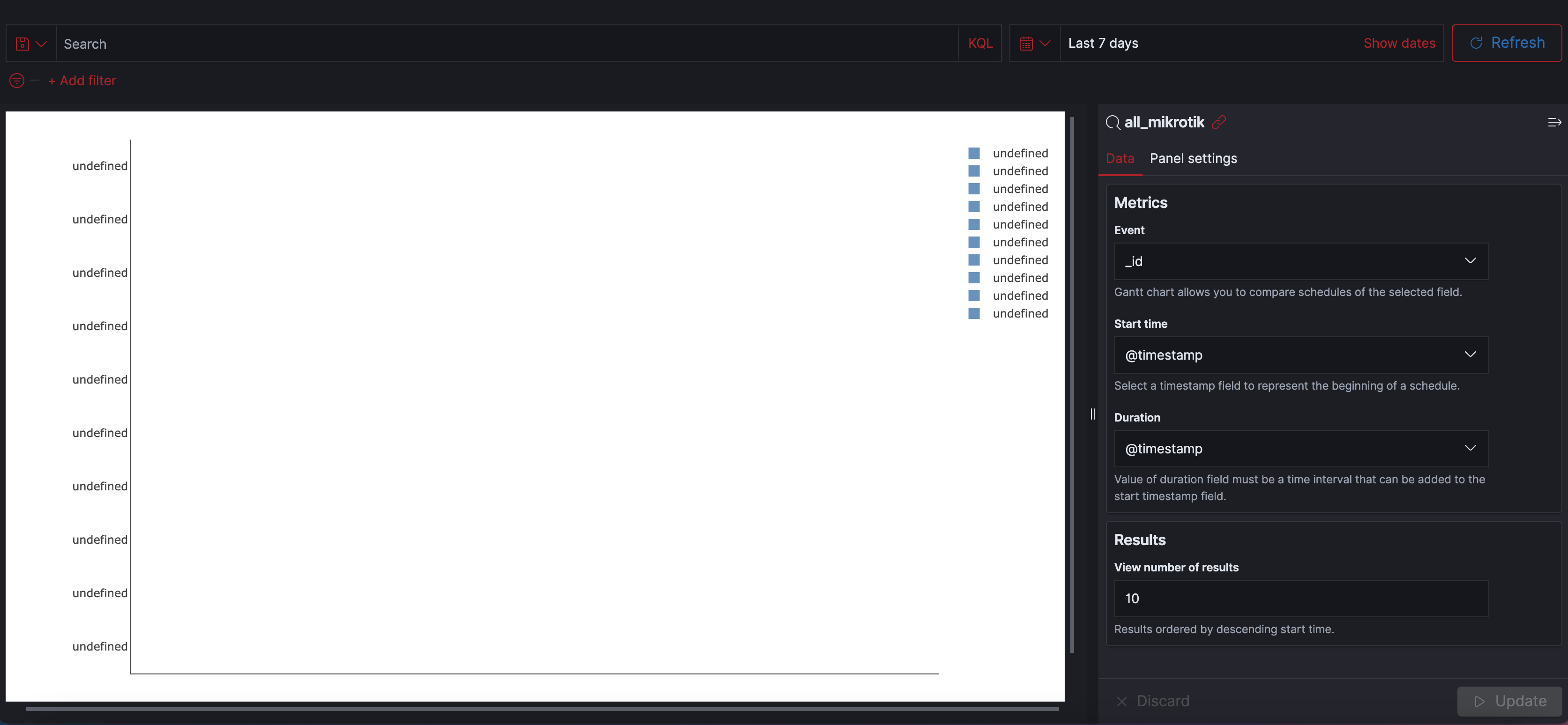
We introduced a new visualization in Kibana that provides the ability to embed Gantt charts. Why? Because Gantt charts are useful in trace analytics, telemetry, and anomaly detection use cases, where you want to understand interactions and dependencies between various events in a schedule.
Gannt charts can be embedded into dashboards to enable visualization of events, steps, and tasks as horizontal bars. These charts can depict the start, end, and duration of unique events in a sequence.
In the Event field, the Gantt chart allows you to compare schedules of the selected field eg. _id.
In the Start time field, you can select a timestamp field to represent the beginning of a schedule.
In the Duration field, the value of this field must be a time interval that can be added to the start timestamp field.
For example, consider an index of log data. The fields in a typical set of log data, especially audit logs, contain a specific operation or event with a start time and duration.
To create a Gantt chart, do the following:
- In the visualizations menu, choose to Create visualization and Gantt Chart.
- Choose a source for the chart (e.g. some log data).
- Under Metrics, choose Event. For log data, each log is an event.
- Select the
**Start Time**and the Duration fields from your data set. The start time is the timestamp for the beginning of an event. The duration is the amount of time to add to the start time. - Under Results, choose the number of events that you want to display on the chart. Gantt charts sequence events from earliest to latest based on start time.
- Choose Panel settings to adjust axis labels, time format, and colors.
- Choose Update.
This Gantt chart the ID for each log on the Y axis. Each bar is a unique event that spans some amount of time. Hover over a bar to see the duration of that event.
Email Alerting
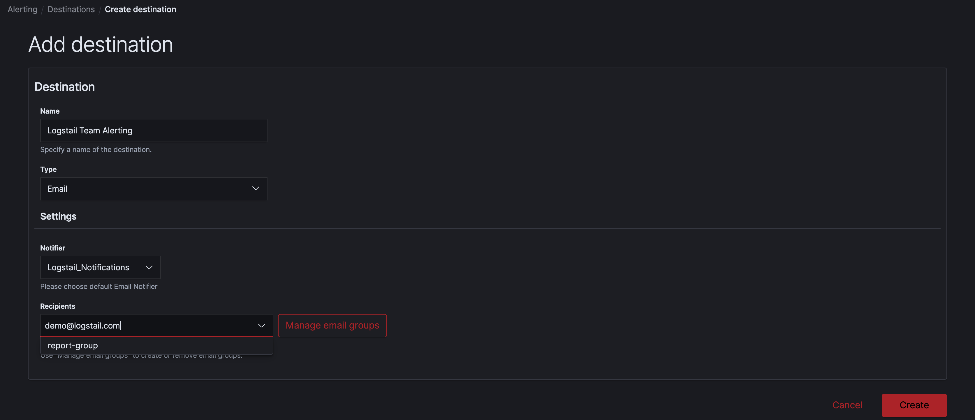
Our alerting mechanism was already very useful for teams, enabling them to monitor their data and send alert notifications automatically to initiate actions. From now on we offer one additional option, the possibility to be alerted by email. By adding this option along with Slack and Webhook which are already in place, you now have a wide range of choices to utilize the alerting mechanism!
Notebooks

Logstail Notebooks is one more feature that enhances the reporting capabilities. A Kibana notebook is an interface that lets you easily combine live visualizations and narrative text in a single notebook interface. Notebooks enables contextual use of data with detailed explanations by allowing a user to combine saved visualizations, text, graphs and decorate data in Elastic with other reference data sources.
Now you can interactively explore data by running different visualizations and share your work with other members of your team!
A notebook is a document composed of two elements: Kibana visualizations and paragraphs in Markdown. Choose multiple timelines to compare and contrast visualizations. Common use cases include creating live infrastructure or postmortem reports or designing runbooks.
Let’s say for example that your infrastructure has encountered an issue and you want to explain the situation or in other words “tell the story” of what happened in order to all members of your team are aware. With Notebooks, you can combine Text and Visualizations to tell the story.
Get Started with Notebooks
To get started, choose Kibana Notebooks in Kibana.
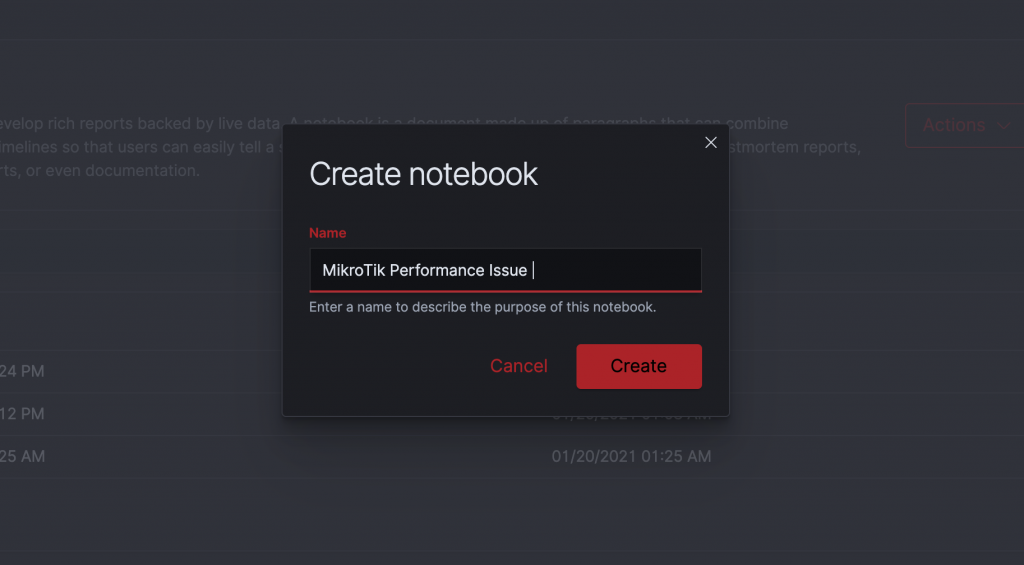
Step 1: Create a notebook
A notebook is an interface for creating reports.
- Choose Create notebook and enter a descriptive name.
- Choose Create.
Choose Notebook actions to rename, duplicate, or delete a notebook.
Step 2: Add a paragraph
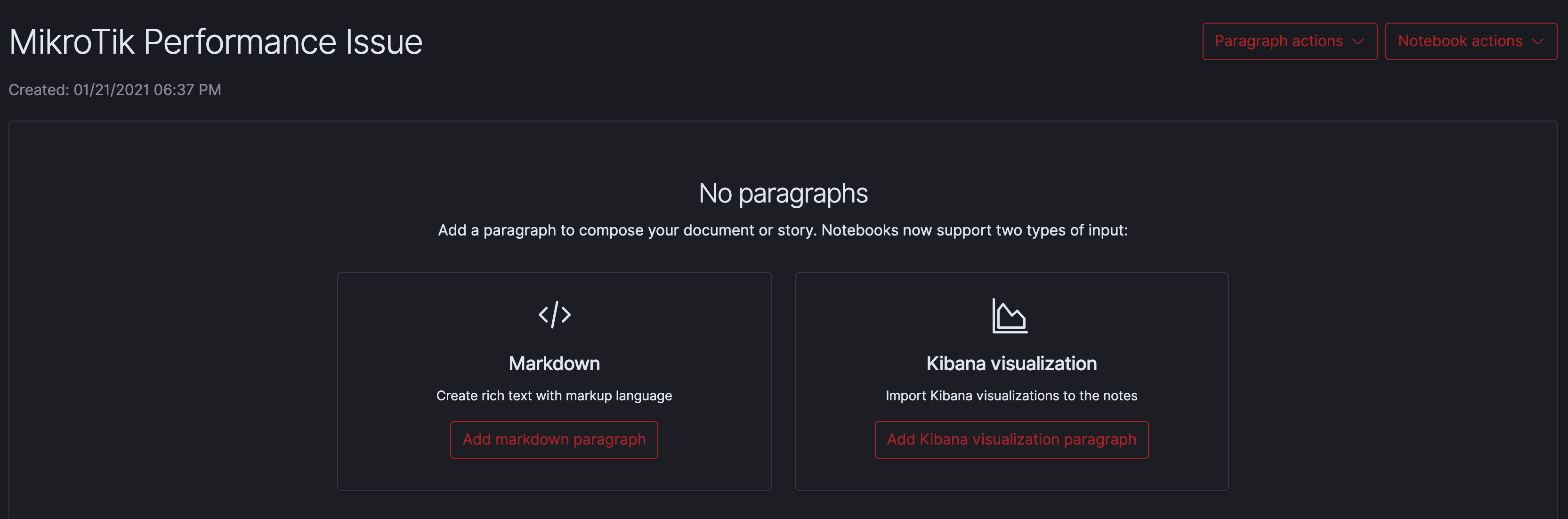
Paragraphs combine text and visualizations for describing data.
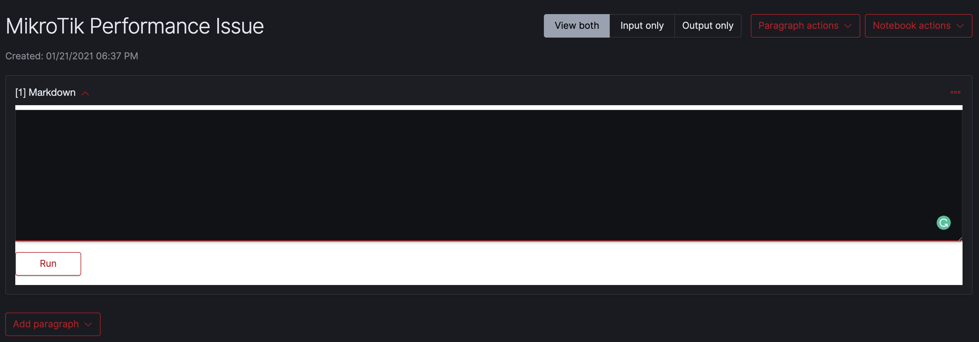
Add a Markdown Paragraph
- To add text, choose Add markdown paragraph.
- Add rich text with markdown syntax.
- You can choose multiple timelines to compare and contrast visualizations.
To run and save a paragraph, choose Run.
You can perform the following actions on paragraphs:
- Add a new paragraph to the top of a report.
- Add a new paragraph to the bottom of a report.
- Run all the paragraphs at the same time.
- Clear the outputs of all paragraphs.
- Delete all the paragraphs.
- Move paragraphs up and down.
Extended team collaboration
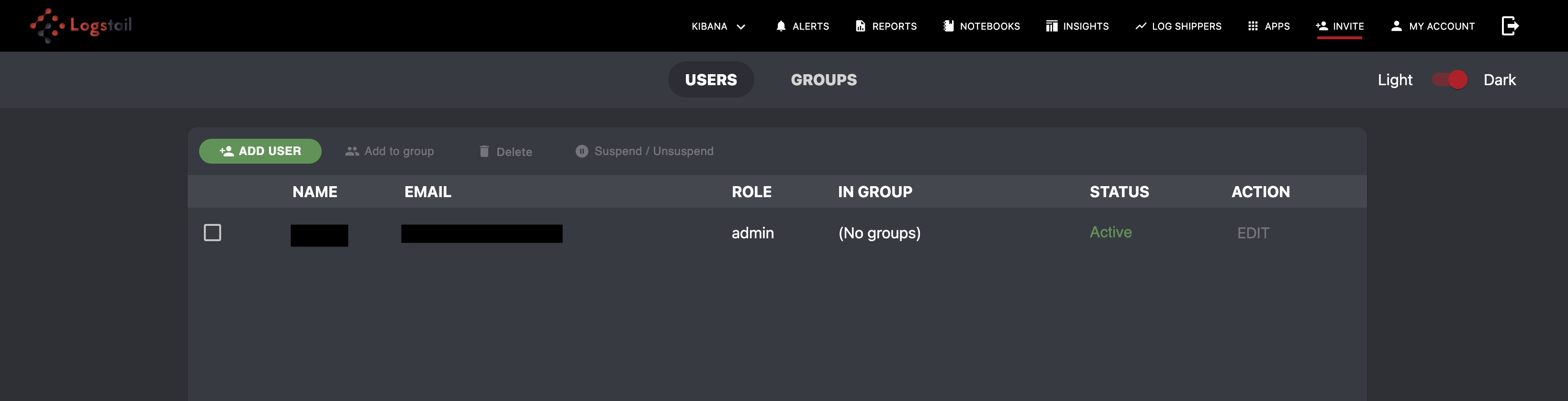
Log management and infrastructure monitoring is a team game. The need for team collaboration was a popular customer-requested feature. Infrastructure monitoring and cybersecurity, require teamwork to quickly resolve issues. That’s why we have focused on adding additional features and apart from the existing alerting choices, now you can invite another user to join to your working environment!
Simply click the Add User button to call a new member to your team!

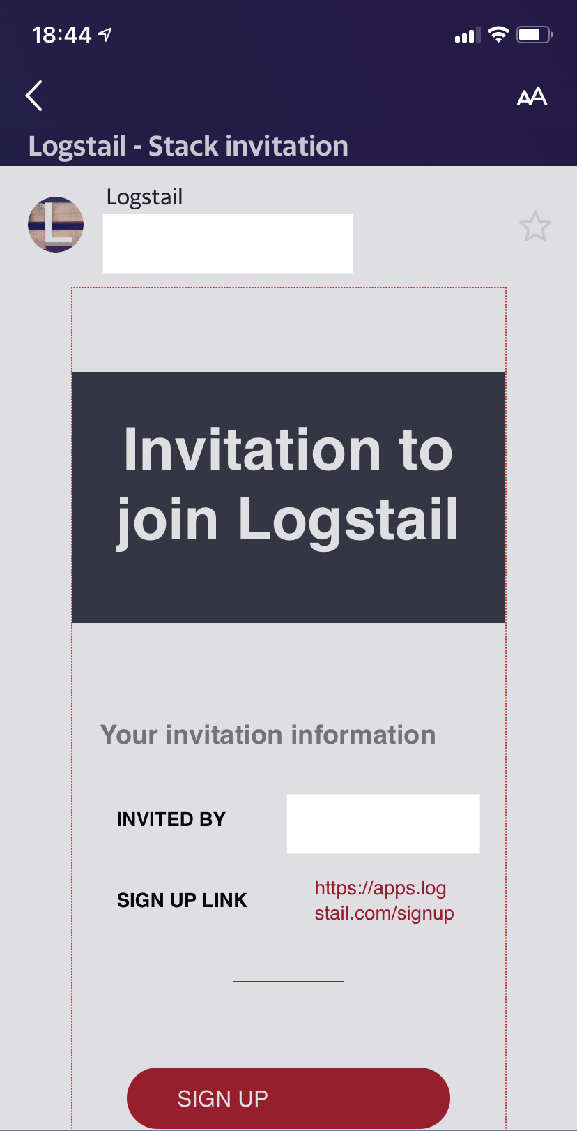
Finally, your new member will receive an invitation to his email in order to join your team!
And last but not least… security
Security for Logstail is at the heart of our mentality. When implementing a new version, we couldn’t make but the best of our efforts to provide an even more secure environment. That’s why a comprehensive set of security features now is here to help you keep your data secure and stay compliant with GDPR, PCI, and ISO! Encryption in-transit and at-rest, Authentication, Role-Based Access Control, audit logging are all carefully implemented to promote the security posture of your company!
Conclusion
This is it! The new version of the platform is out. In this article, we have provided a detailed explanation of the new features and functionalities as well as how to utilize them. But like all things in life, you will not get the full potential of the platform if you don’t try it yourself. In Logstail we believe that Elastic Stack is a great piece of software, but it comes with some obstacles for a Small to Medium Business to overcome in order to take the full potential out of it.
Our cloud-hosted solution with all these advanced features brings the functionality of centralized monitoring to your hands. Convert your data into actionable insights and maximize the performance of your infrastructure or be notified of potential problems and take the appropriate actions. Sign-up for a free demo in order to realize the power of Logstail!