July 17, 2020
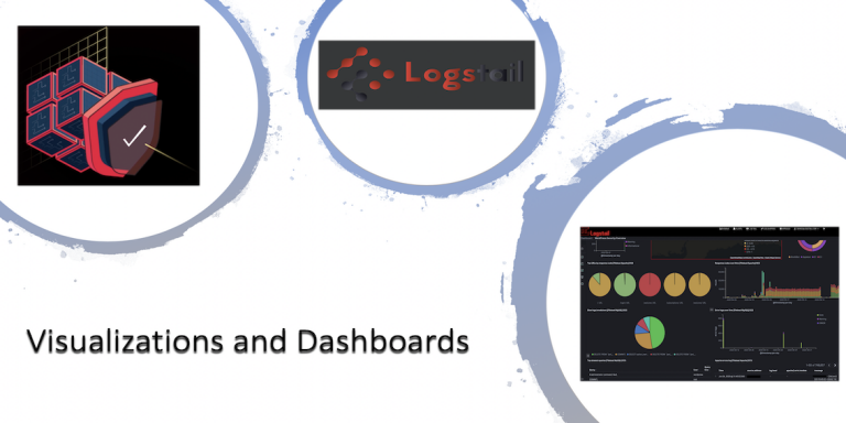
How to create visualizations and dashboards in Logstail

What are the visualizations and dashboards?
A data visualization is a graphical representation of information or data. The human eye can understand far more easily a pattern or a trend when visual elements like charts, graphs, or maps are utilized. Data visualization tools are very important and useful when we are called to analyze massive amounts of information in order to take appropriate actions. We are exaggerating when we claim that a good visualization can tell a story, by removing any unnecessary noise from data and highlighting the useful information.
Logstail gives you the potential of converting your data into visualized objects and gain the full potential out of it.
Visualize is an essential feature of ELK Stack which enables you to create visualizations of the data from your Elasticsearch indices.

Kibana visualizations are based on Elasticsearch queries. By using a series of Elasticsearch aggregations to extract and process your data, you can create charts that show you the trends, spikes, and many more that you need to know about.

Which are the available types of visualizations?

Logstail supports several types of visualizations such as:
Line – emphasize in trends
Area – emphasize the quantity beneath a line chart
Bar charts (Horizontal or Vertical) – Assigns a continuous variable to each axis and compares different series in X/Y charts
Pie chart – Compare parts of a whole
Data table – Displays values in a table
Metric – Displays a calculation as a single number
Goal – A goal chart indicates how close you are to your final goal
Gauge – Gauge indicates the status of a metric. Use it to show how a metric’s value relates to reference threshold values
Tag cloud – A group of words, sized according to their importance
Heat map – Shade cells within a matrix
Markdown – Creates a document using markdown syntax
Region map – Show metrics on a thematic map. Use one of the provided base maps or add your own. Darker colors represent higher values
Timelion – Build time series using functional expressions
Visual Builder – Build time series using a visual pipeline interface
Control (Experimental)- Create interactive controls for easy dashboard manipulation
Vega (Experimental)- Create custom visualizations using Vega and Vega-Lite
Gantt Chart – Create a Gantt Chart to demonstrate the progress of a particular metric.
Creating a new visualization
Creating a new visualization, sometimes requires a learning curve but it always pays off. The challenge here is that each visualization type is different. Each has different configuration options and each involves different building steps. Still, there are some basic common steps that can be described.
In the example below, we will visualize the Browers Breakdown from Apache server metrics extracted from our test environment in pie chart.
To create a new Logstail hosted Kibana visualization, select Visualize in the menu on the left, click the + Create new visualization icon

and then select the visualization you want to create. In this example, we will create a pie chart to compare parts with logstail-apache as our data source

Depending on the different type of visualizations, we are presented with different configuration panes. The basic charts have three different panels: Data, Metrics & Axes and Panel Settings, while the other types only have Data and Options, like this example. The Data panel contains the most important configuration settings, like Metrics and Buckets. Metrics are aggregations that compute metrics based on values extracted from the data that is being aggregated.

The Options Pane gives us the ability to configure the settings of the appearance of your visualizations. In our example, we can adjust the legend position of the pie or we can show the labels. Each visualization can be configured in different means to give the meaningful result we want to get.

The end result in our example is the following

By adjusting the Aggregation from Unique Count to Sum, the result is the following

Save the visualizations
When we have configured our visualization, we need to save it (otherwise we will lose it!!).
In the Kibana toolbar, we have to click Save.
Enter the visualization Title then Confirm Save the visualization.

Dashboards and Apps2Go
A dashboard is a collection of visualizations, searches, and maps previously created, which provide a quick look into your data and enable you to get the desired insight. Dashboards are also highly configurable, giving you the ability to:
- Add visualizations, saved searches, and maps for side-by-side analysis
- Arrange dashboard elements to fit according to your specific needs
- Inspect and edit the elements to only display the data you want
- Customize the time ranges to focus on the elements you seek
And if all the above seem complicated to you or your team, then Logstail team has the solution!
We created the Apps free library of pre-made Kibana visualizations and dashboards for different log types, as shown below.

Conclusion
Logstail with its advanced features brings the functionality of ELK Stack to your hands. You don’t have to be an engineer in order to set up and use Elasticsearch anymore. Now you can convert your data into actionable insights with just some tweaks. You can maximize the performance of your infrastructure or be notified of potential problems and take the appropriate actions. Visualizing data in Kibana is a useful feature but it is also not a trivial one. In this article, we showed examples of creating a visualization, but don’t forget that there are 16 different types of visualizations available in Logstail. Also, always remember that Logstail support team is always there to help you create a custom visualization. Sign-up for a free demo in order to realize the power of Logstail!