Visualizations
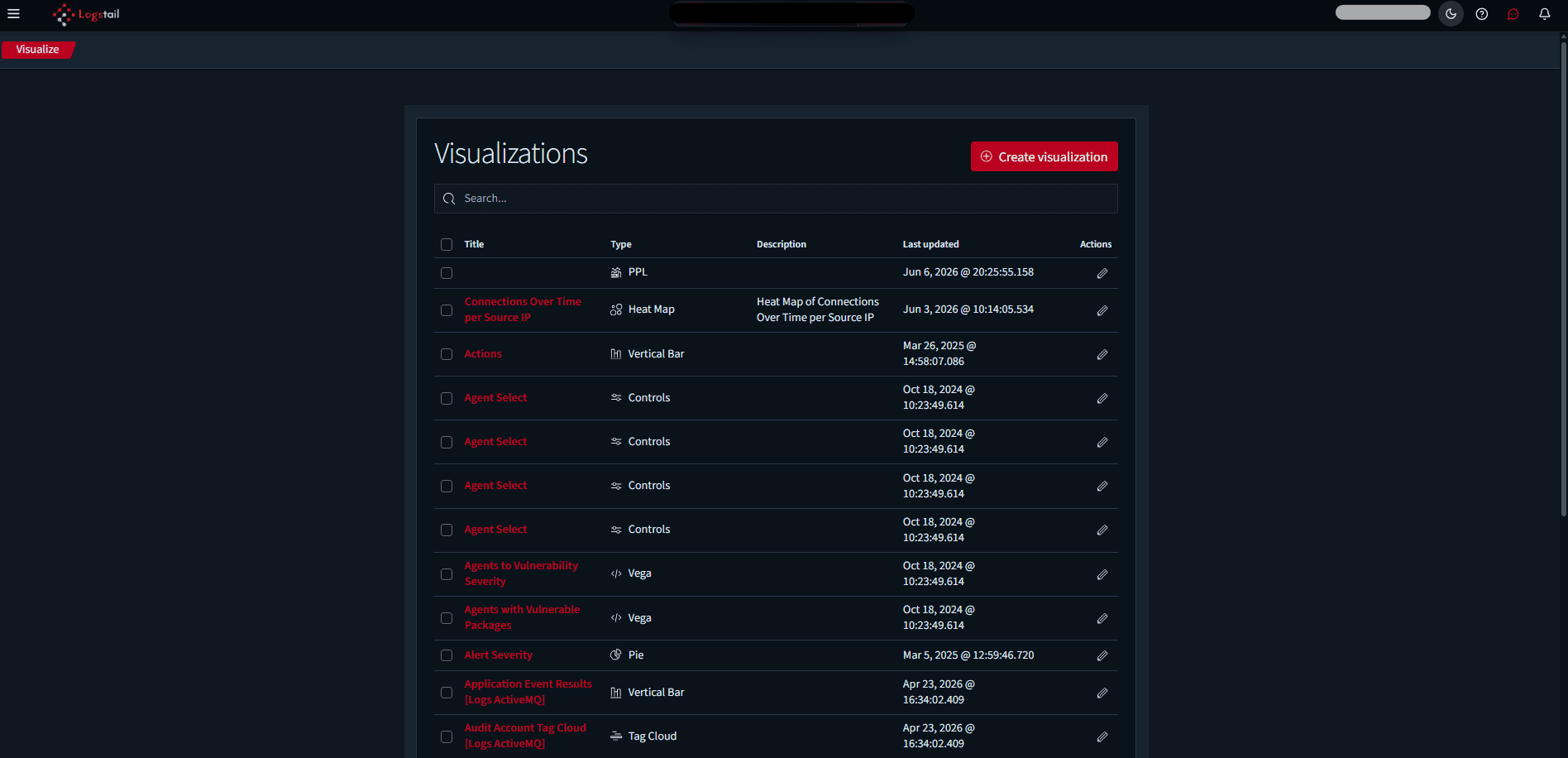
The Visualizations page is used to create and view visual components that can be used in dashboards and analytics workflows. Visualizations transform raw event data into charts, graphs, counters, tables, and other visual formats that help users understand patterns quickly.
Where to find it
Open the Visualizations page to create and manage visual panels for dashboards.
Sidebar path
Route path
/visualizationsWhat this page is used for
Use Visualizations to:
Build charts
Create visualizations from indexed data.
Use saved searches
Turn searches into visual panels.
Create reusable components
Build visual elements for dashboards.
Support dashboards & reports
Feed visualizations into analytics workflows.
Highlight trends
Show counts, distributions, and relationships.
Support SOC workflows
Build focused views for investigations.
Main View
Visualizations open in a full-page embedded visualization builder or viewer.
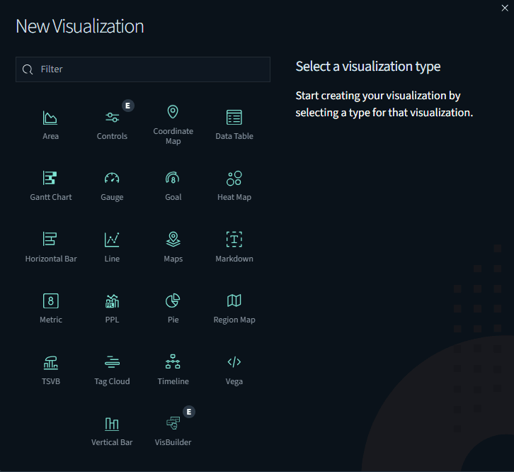
Visualization Types
Available visualization types include: For each visualization, there is a description showing when hovering.
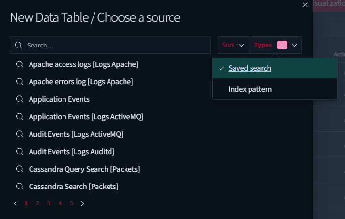
Creating a Visualization
A typical visualization workflow is:
What Fields Mean
In the visualization creation process, fields are the individual data attributes stored inside indexed events.
A field is a specific value collected from logs, metrics, alerts, endpoint events, network data, or other telemetry sources. Fields tell the visualization what data to use.
Fields are used to decide what the visualization should count, group, split, filter, or display.
For example:
Bar chart
Group events by agent.name to visualize activity across endpoints.
Line chart
Use @timestamp to show event volume and trends over time.
Pie chart
Split alerts by rule.severity to understand distribution across severity levels.
Data table
Display multiple fields such as host.name, user.name, and event.action for detailed analysis.
Metric counter
Count all records that match the selected query to highlight totals or key indicators.
Examples of Fields Users May Select
The available fields depend on the selected index pattern, saved search, and collected data.
| Field | Description |
|---|---|
| @timestamp | Event time used for time-based charts |
| agent.name | Name of the endpoint agent |
| agent.ip | IP address of the endpoint agent |
| host.name | Hostname of the system |
| user.name | User associated with the event |
| event.action | Action recorded by the event |
| event.category | Event category such as process, network, authentication, or file |
| event.dataset | Dataset or log source |
| log.level | Log level such as info, warning, error, or critical |
| process.name | Process name |
| process.executable | Full executable path |
| process.parent.executable | Parent process executable path |
| source.ip | Source IP address |
| destination.ip | Destination IP address |
| network.protocol | Network protocol |
| rule.name | Detection or rule name |
| rule.severity | Detection or alert severity |
| service.name | Service name |
| winlog.channel | Windows Event Log channel |
| winlog.event_id | Windows Event ID |
Choosing the Right Data Source
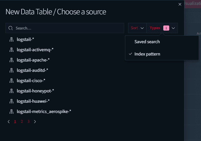
For SIEM use cases, select the relevant SIEM index pattern, commonly: logstail-siem-*
Use a saved search when the visualization should always include a specific query or filter set.
Saving Visualizations
When saving a visualization, use a name that clearly describes:
Good naming makes it easier to manage saved objects later.
Examples of clear names:
Operational Examples
Alert Volume Over Time
Create a time-series visualization that shows detection or alert counts over a selected time window.
Recommended configuration:
Authentication Failures by User
Create a bar chart showing failed authentication events grouped by user.
Recommended configuration:
Endpoint Activity by Host
Create a table or chart that groups events by agent.name.
Recommended configuration:
Process Execution Trends
Create a visualization that tracks process creation events by executable path or parent process.
Recommended configuration:
Network Activity by Protocol
Create a chart that compares network activity by protocol.
Recommended configuration:
Troubleshooting
Visualization shows no data
- 1
Check the index pattern, time range, query filters, and field selection.
Field is missing
- 1
Confirm that the field exists in Discover for the selected index pattern.
- 2
If the field exists in raw events but does not appear in the visualization builder, refresh the index pattern or check whether the field is available for aggregation.
Chart does not update
- 1
Refresh the visualization or adjust the time range.
Visualization cannot be added to a dashboard
- 1
Confirm the visualization was saved successfully.
- 2
Confirm that the dashboard supports adding saved panels.
Results look incorrect
- 1
Review the selected metric, bucket, field, filter, and time range.
- 2
If grouping by host, confirm that the visualization uses agent.name or host.name instead of a unique event field.
Best Practices
Start from validated data
Build visualizations from validated Discover queries.
Keep visualizations focused
Use focused visualizations with a clear operational purpose.
Choose the right fields
Choose fields based on the question the visualization should answer.
Use time fields
Use @timestamp for time-based visualizations.
Group by category
Use fields such as agent.name, host.name, user.name, rule.severity, or network.protocol for grouped charts.
Limit categories
Avoid charts with too many categories.
Use consistent naming
Save visualizations with consistent naming.
Review after changes
Recheck visualizations after field or index changes.
Back up content
Use saved objects to back up important visualization content.